7 Data visualization with ggplot2
7.1 Building a plot
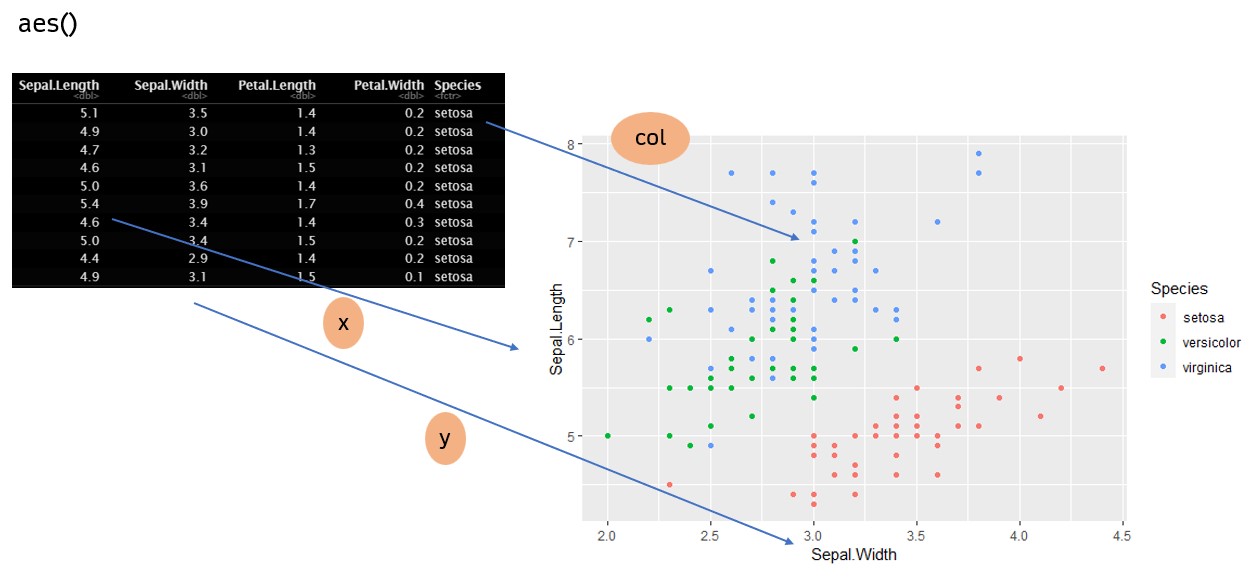
ggplot2 คือ Package ย่อยอีกตัวของ tidyverse ซึ่งใช้สำหรับการพล็อตกราฟ
7.1.1 Anatomy of ggplot
-
aesคือ aesthetic ซึ่งหมายถึงการ map ข้อมูลของท่านเข้ากับตำแหน่งของกราฟ-
x= แกน x,y= แกน y -
col= สี,fill= สีพื้นหลัง
-
-
geom_*()คือ การกำหนดว่าท่านต้องการที่จะ plot กราฟอะไร -
theme_*()คือ การกำหนด theme ของกราฟ เพื่อความสวยงาม เช่นtheme_bw(),theme_classic() -
…คือการปรับแต่งอื่นๆ ในส่วนของ Customization
การสร้างภาพที่สมบูรณ์นั้นมีส่วนจำเป็นที่ประกอบด้วย aes และ geom ตรงส่วนอื่นเป็นส่วนเสริมที่จะช่วยให้ภาพมีความสวยงามขึ้น
สังเกตว่าจะยังไม่มีกราฟใดๆ ปรากฏ ท่านจำเป็นต้องใช้ geom เพื่อทำการสร้างภาพนั้นขึ้น
7.1.2 Scatter plot
ggplot(df, aes(x = Sepal.Width, y = Sepal.Length,
               col = Species, shape = Species)) +
  geom_point()
สังเกตการ mapping ของ aes()
7.1.3 Straight line
ท่านสามารถเพิ่มเส้นที่ท่านต้องการได้โดย geom_hline (แนวตั้ง), geom_vline (แนวนอน), geom_abline (แนวเฉียง)
ggplot(df, aes(x = Sepal.Width, y = Sepal.Length, col = Species)) +
  geom_point() +
  geom_hline(yintercept = 6, linetype = "dashed",
             col = "red", linewidth = 1) +
  geom_vline(xintercept = 2.7, linetype = "dotted",
             col = "blue", linewidth = 1.25) +
  geom_abline(intercept = 2, slope = 1,
              linetype = "dotdash", col = "black", linewidth = 1.5)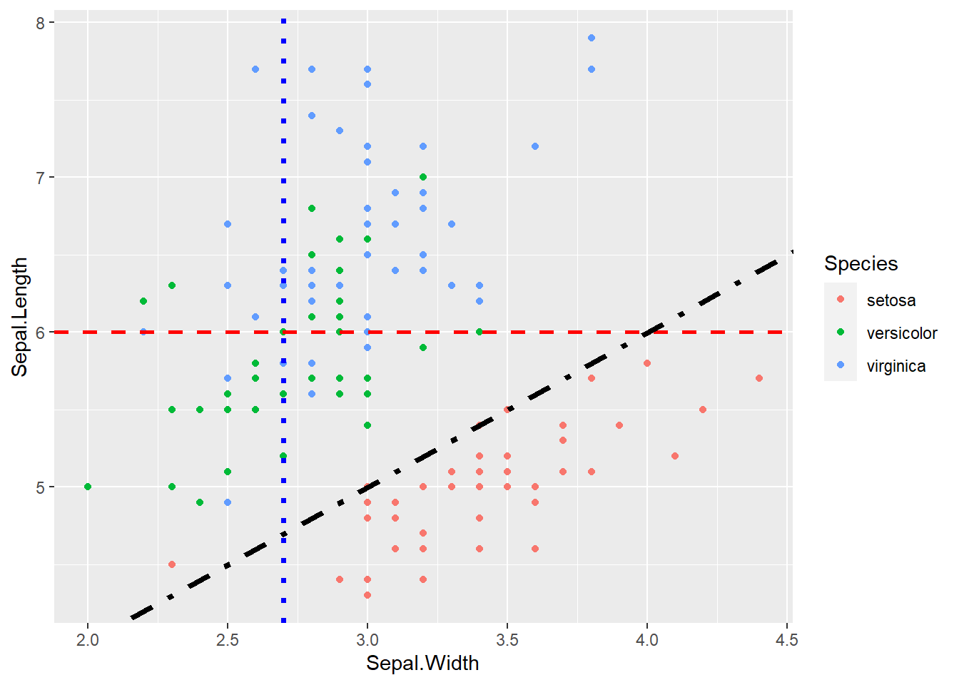
สังเกตว่าท่านสามารถปรับค่าจำพวก สี ลักษณะเส้นต่างๆ ได้ โดย Parameter นั้น ต้องอยู่นอก aes มิเช่นนั้น ฟังก์ชันจะพยายามไปดึงข้อมูลจากกราฟมา
ggplot(df, aes(x = Sepal.Width, y = Sepal.Length, col = "darkviolet")) + # ผิด
  geom_point() +
  geom_hline(yintercept = 6, linetype = "dashed",
             col = "red", linewidth = 1) +
  geom_vline(xintercept = 2.7, linetype = "dotted",
             col = "blue", linewidth = 1.25) +
  geom_abline(intercept = 2, slope = 1,
              linetype = "dotdash", col = "black", linewidth = 1.5)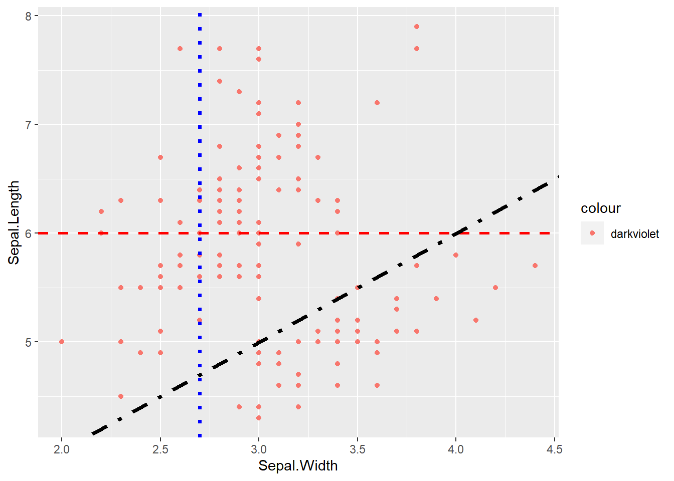
ที่ถูกต้อง ท่านต้องนำ col ไปอยู่นอก aes จึงจะได้สีที่ท่านต้องการ
ggplot(df, aes(x = Sepal.Width, y = Sepal.Length)) + # ผิด
  geom_point(col = "darkviolet") +
  geom_hline(yintercept = 6, linetype = "dashed",
             col = "red", linewidth = 1) +
  geom_vline(xintercept = 2.7, linetype = "dotted",
             col = "blue", linewidth = 1.25) +
  geom_abline(intercept = 2, slope = 1, linetype = "dotdash",
              col = "black", linewidth = 1.5)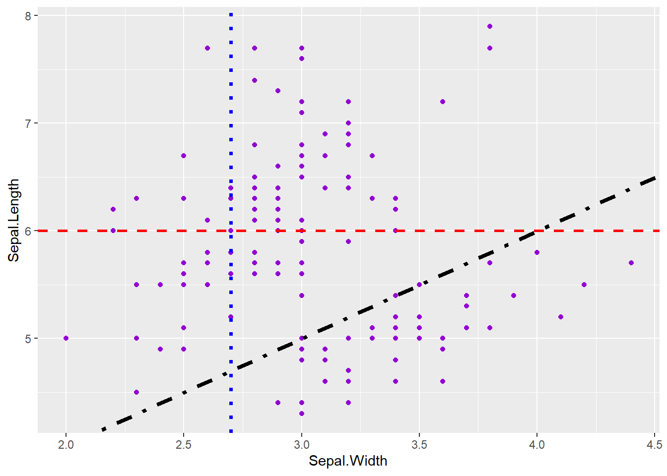
7.1.4 Bar chart
geom_bar() ใช้สำหรับนับจำนวนของคอลัมน์นั้น ไม่มีค่า y
ggplot(df, aes(x = Species, fill = Species)) + # fill ไว้สำหรับแบ่งสีใน barchart
geom_bar(col = "black", width = 0.5) # ความกว้าง 50% 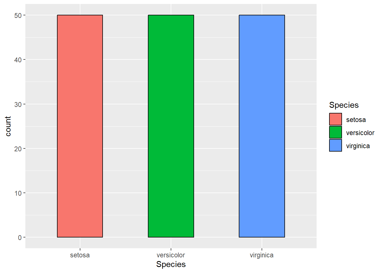
ส่วน geom_col() จะรับค่า y ด้วย โดยข้อมูล x ที่ซ้ำกันจะถูกนำมารวมกัน
ggplot(df, aes(x = Species, y = Sepal.Width, fill = Species)) +
geom_col(col = "black", width = 0.5) 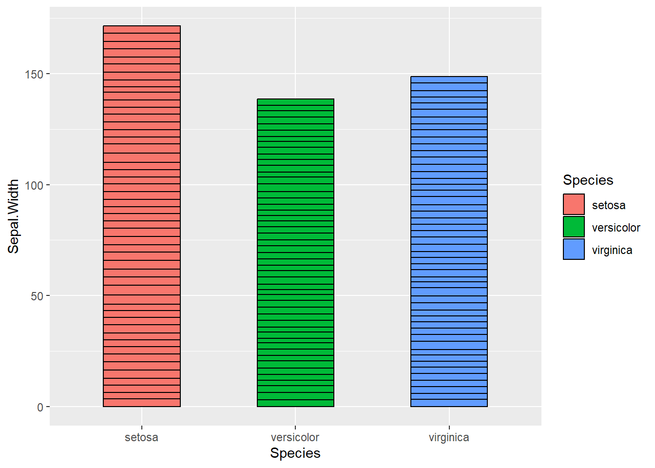
สังเกตว่าค่าที่ได้เกิดจากการรวมกันของข้อมูลทั้งคอลัมน์ (สังเกตที่เส้นสีดำเป็นเส้นต่อๆ กัน ไม่ใช่เส้นเดียว) ซึ่งมักไม่เป็นที่ต้องการในการแสดง โดยมักเกิดจากความผิดพลาดมากกว่า (โดยเฉพาะถ้าไม่ได้ใส่ col = black) และส่วนใหญ่มักจะใช้ในการแสดงค่าเฉลี่ยมากกว่าผลรวม ในการนี้ ควรใช้คำสั่ง dplyr::summarize() ในการสรุปข้อมูลก่อน
df |>
  group_by(Species) |>
  summarize(across(everything(), mean)) |>
  ggplot(aes(x = Species, y = Sepal.Width, fill = Species)) +
geom_col(col = "black", width = 0.5) 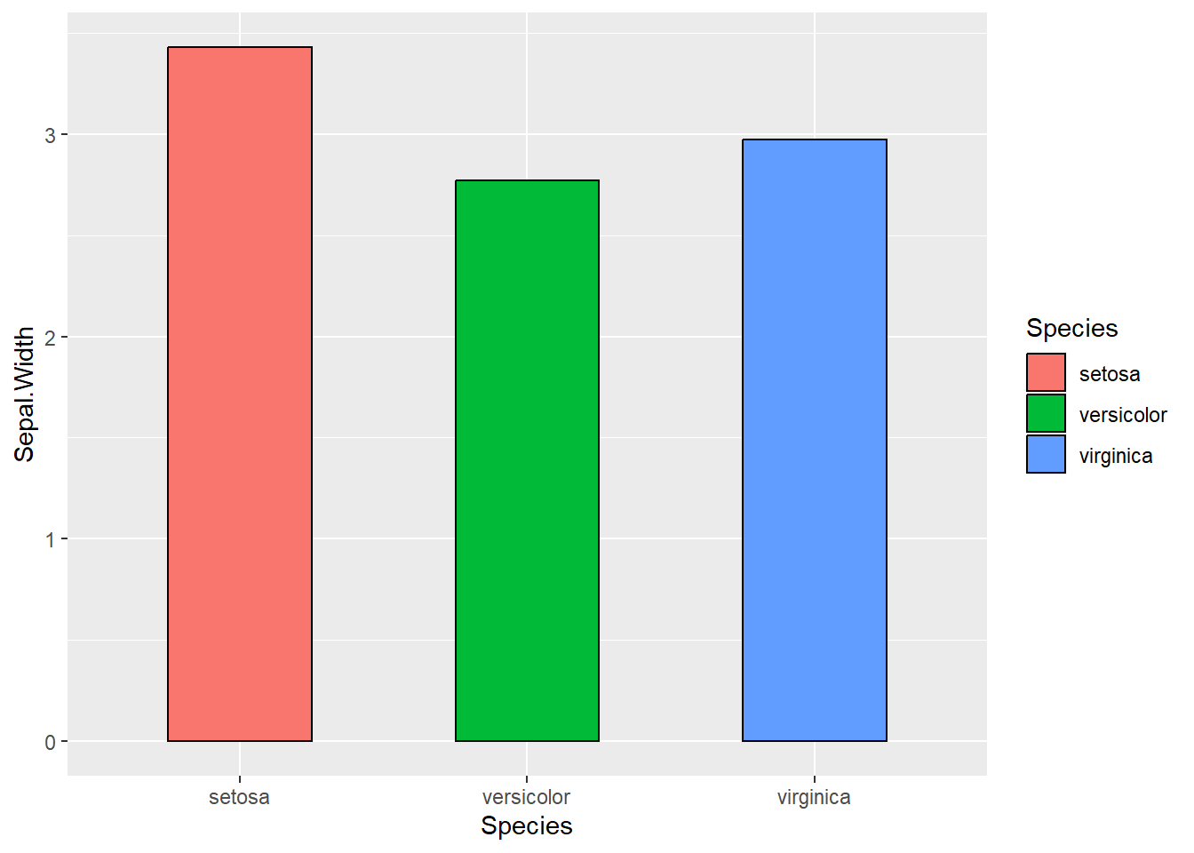
จะเห็นว่ากราฟแสดงค่าเฉลี่ยซึ่งตรงตามความต้องการทั่วไปมากกว่า (สังเกตแกน y)
7.1.5 Box plot
ทำการสร้าง Box plot
ggplot(df, aes(x = Species, y = Sepal.Width, fill = Species)) +
geom_boxplot(width = 0.5) 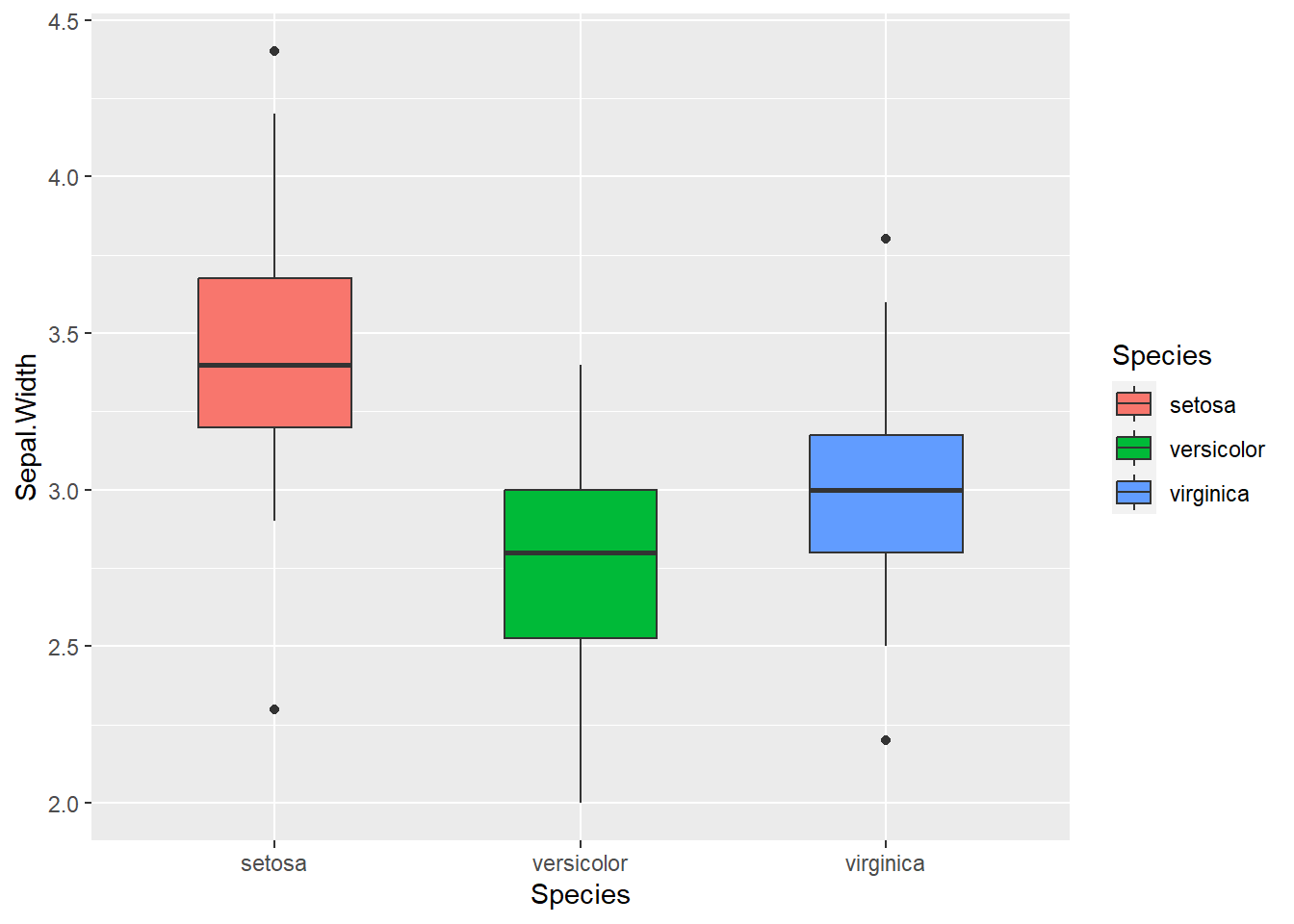
ถ้าท่านต้องการสร้าง Plot ที่แสดงหลาย metrics ท่านจะต้องเปลี่ยนข้อมูลเป็น Long form เสียก่อน
head(long_df, 10)
long_df |>
    ggplot(aes(x = Species, y = cm, fill = Metrics)) +
geom_boxplot() 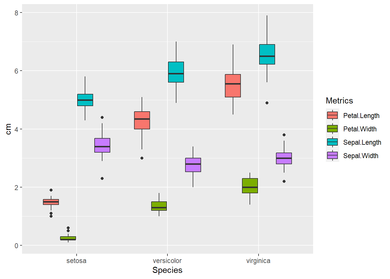
7.1.6 Histogram
ในการทำงานสถิตินั้น โดยส่วนใหญ่จะต้องทำการตรวจสอบการกระจายของข้อมูลก่อนวิเคราะห์ทางสถิติ ซึ่งสามารถทำได้โดยใช้ geom_histogram() หรือ geom_density() โดยท่านสามารถเลือกประเภทของข้อมูลที่ใช้ในแกน y ได้โดยใช้ after_stat()
ggplot(df, aes(x = Sepal.Width)) +
  geom_histogram(fill = "skyblue", binwidth = 0.1)  # binwidth = ความกว้างของแต่ละช่วงข้อมูล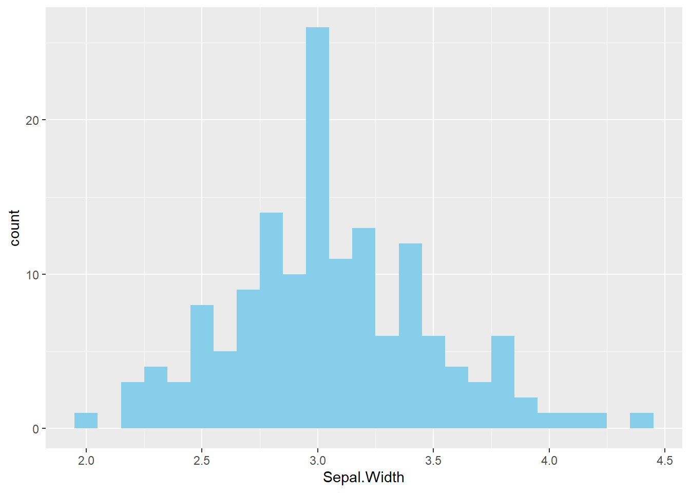
ggplot(df, aes(x = Sepal.Width, y = after_stat(density))) + # ใช้ density
geom_histogram(fill = "skyblue", binwidth = 0.1) 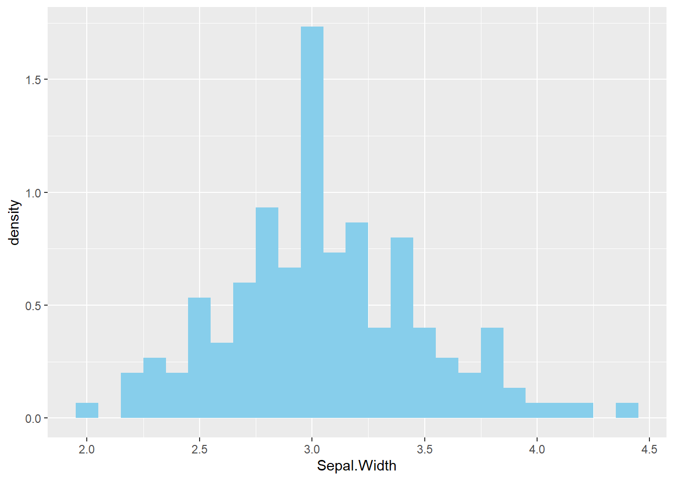
ggplot(df, aes(x = Sepal.Width)) +
  geom_density(fill = "violet", alpha = 0.5)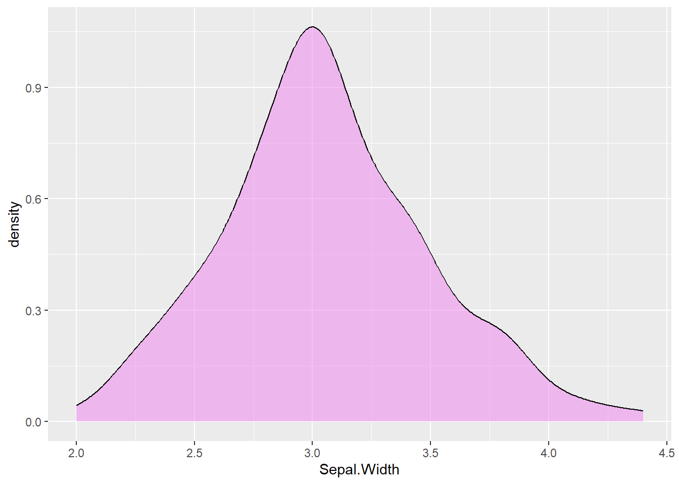
ggplot(df, aes(x = Sepal.Width, y = after_stat(count))) + # ใช้ count
  geom_density(fill = "violet", alpha = 0.5)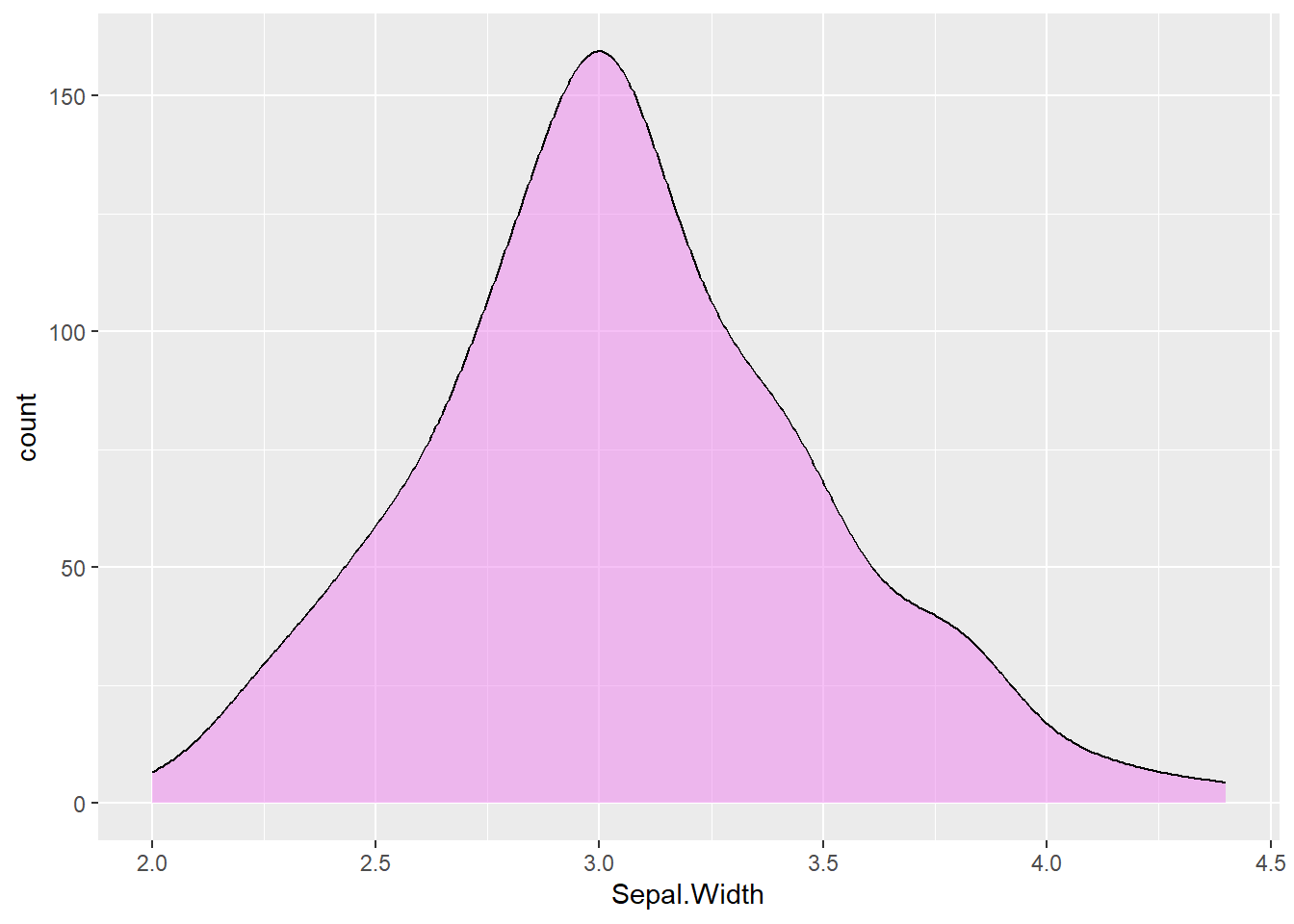
ทั้งนี้ ท่านสามารถพล็อตหลายกราฟเข้าด้วยกันได้ ด้วยการ + ตามหลังไปเรื่อยๆ เพียงแต่ต้องระวังเรื่อง scale ที่ต้องเป็นระดับเดียวกัน
ggplot(df, aes(x = Sepal.Width)) +
  geom_histogram(aes(y = after_stat(density)),
                 binwidth = 0.1, fill = "skyblue") + # ปรับเป็นความถี่
  geom_density(fill = "violet", alpha = 0.5) +
  theme_bw() # ลบภาพพื้นหลังสีเทาออก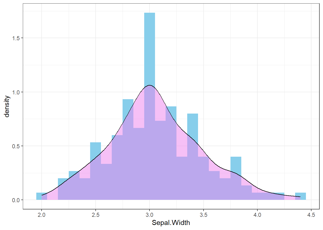
7.1.7 Fitting a statistical model
ท่านสามารถที่จะพล็อต Statistical model ได้โดยใช้ geom_smooth() ยกตัวอย่าง เช่น ถ้าอยากดูความสัมพันธ์ของ Sepal.Length และ Petal.Length
ggplot(df, aes(x = Sepal.Length, y = Petal.Length, color = Species)) + # สีตาม Species
  geom_point(color = "black") +
  geom_smooth(method = "loess") # fit a LOESS model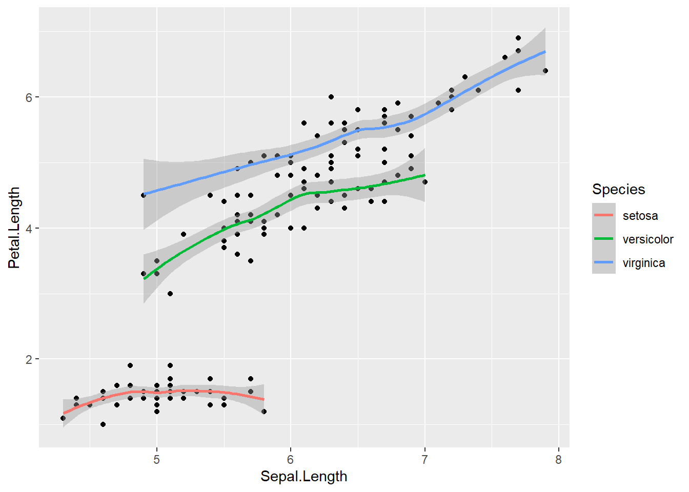
ggplot(df, aes(x = Sepal.Length, y = Petal.Length, color = Species)) + # สีตาม Species
  geom_point(color = "black") +
  geom_smooth(method = "lm") # fit a linear model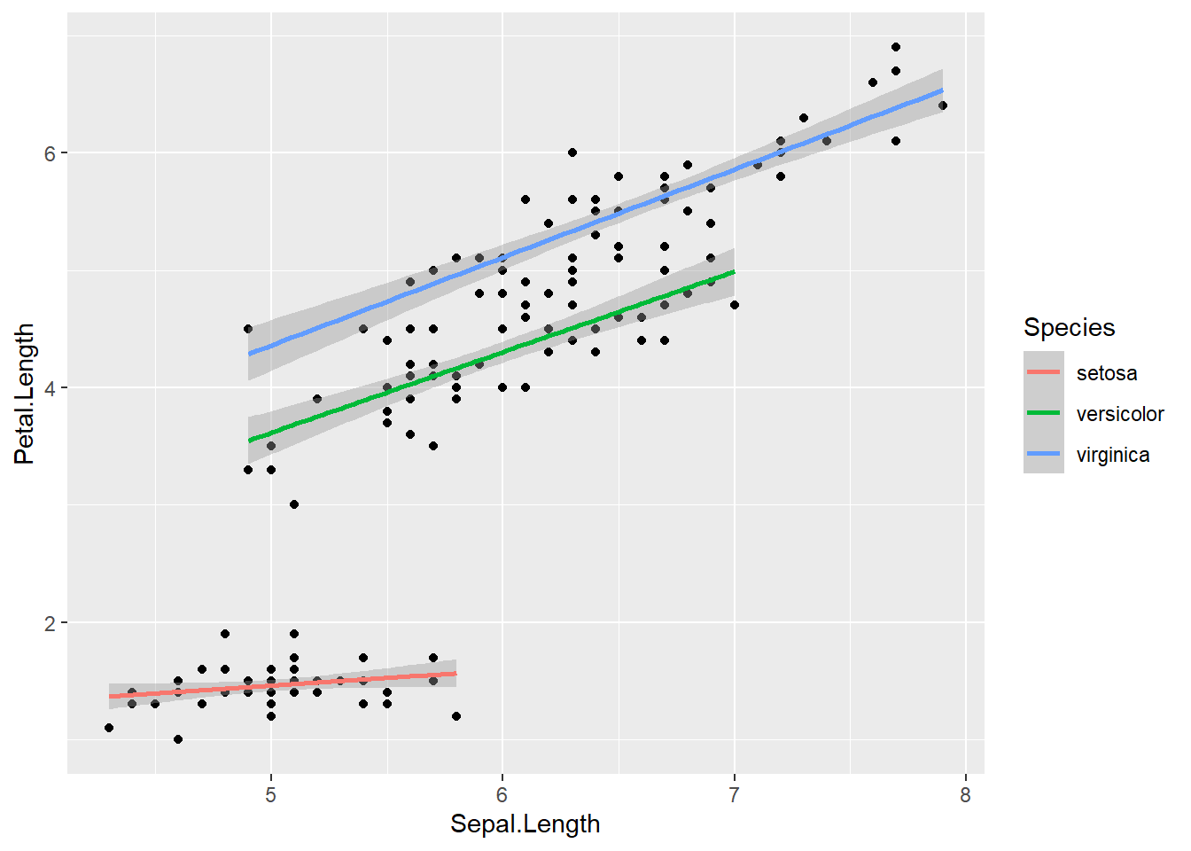
7.2 Customization
7.2.1 Faceting
ในบางครั้งท่านอาจจะต้องการที่จะพล็อตกราฟแยกกันเป็นส่วนๆ มากกว่ารวมกันในกราฟเดียว ท่านสามารถแบ่ง Partition ของการพล็อตแต่ละกลุ่มได้โดยใช้ facet_wrap()
ggplot(df, aes(x = Sepal.Length, y = Petal.Length,
               color = Species)) + # สีตาม Species
  geom_point(color = "black") +
  geom_smooth(method = "lm") +
  facet_wrap(~Species) + # แบ่งเป็นหลายกลุ่ม
  theme_bw()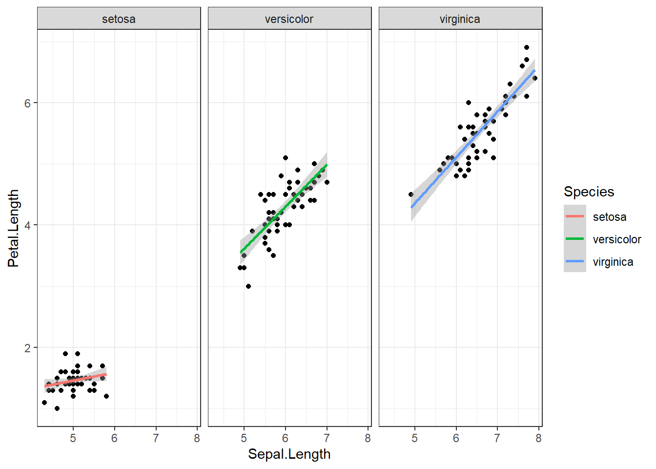
ggplot(df, aes(x = Sepal.Length,  fill = Species)) + # สีตาม Species
  geom_histogram(binwidth = 0.1) +
  facet_wrap(~Species, scales = "free_x", nrow = 2) + # ทำให้แกน x ไม่ fix ค่า
theme_bw() 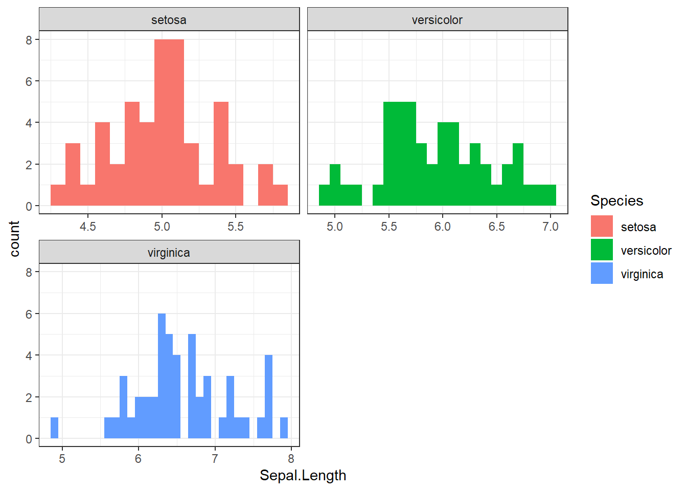
และถ้าท่านต้องการเรียงข้อมูลให้เป็นไปตามแกนที่ท่านต้องการ สามารถใช้ facet_grid()
ggplot(mtcars,
       aes(x = mpg, y = disp, color = as.factor(cyl))) +
  facet_grid(vs + am ~ gear,
             labeller = label_both, # แสดงชื่อและข้อมูล
             scale = "free") +
  geom_point() +
  theme_bw()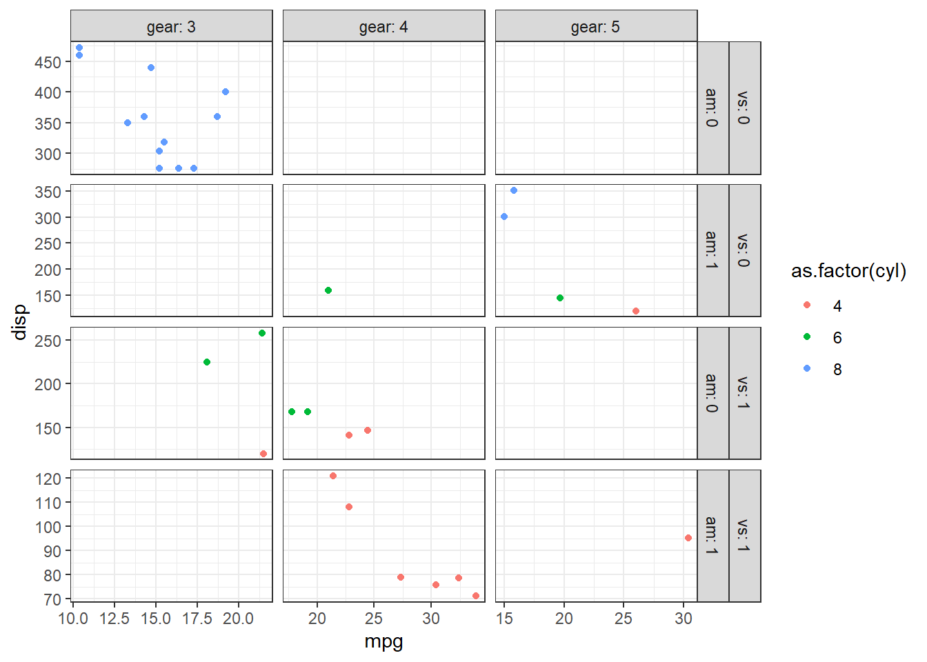
7.2.2 Labels
ท่านสามารถปรับแต่งชื่อของแต่ละตำแหน่งได้โดยใช้ labs()
ggplot(df, aes(x = Sepal.Width, y = Sepal.Length, col = Species)) +
  geom_point() +
  labs(title = "Iris dataset", subtitle = "Sepal length vs Sepal width",
       x = "Sepal width", y = "Sepal length",
       color = "List of species",
       tag = "1") +
  theme_bw()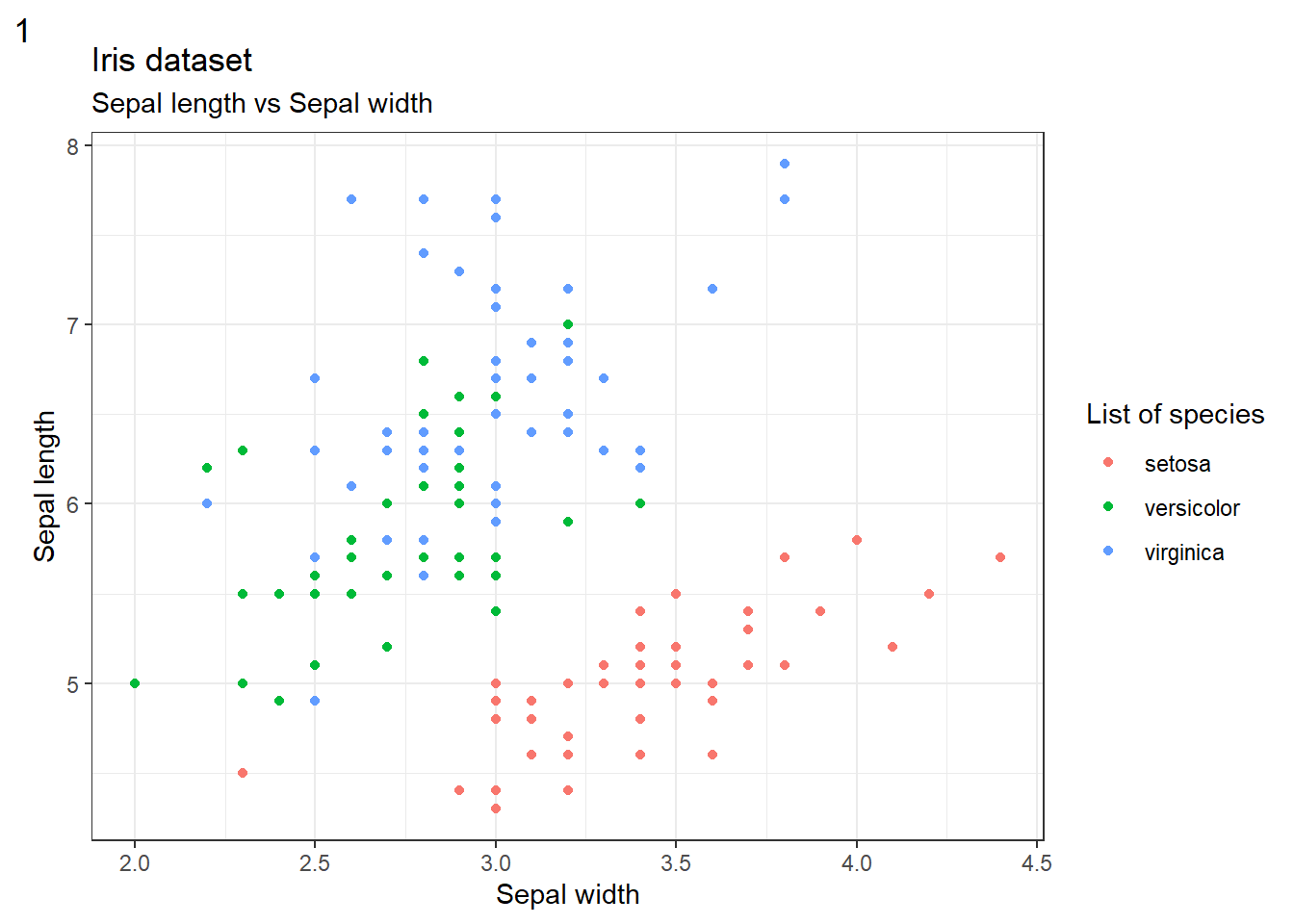
สำหรับสัญลักษณ์ทางคณิตศาสตร์สามารถแสดงได้โดยใช้คำสั่ง bquote()
poly_data <- data.frame(x = seq(-10, 10, length.out = 100)) |>
  mutate(y = x^9+x+10+rnorm(100, mean = 0, sd =3))

ggplot(poly_data, aes(x = x, y = y)) + geom_point() +
  geom_smooth(method = "lm", se = FALSE) +
  labs(y = bquote("This function is" ~ f(x) == x^9+x+10+epsilon ~ ".")) +
  theme_bw()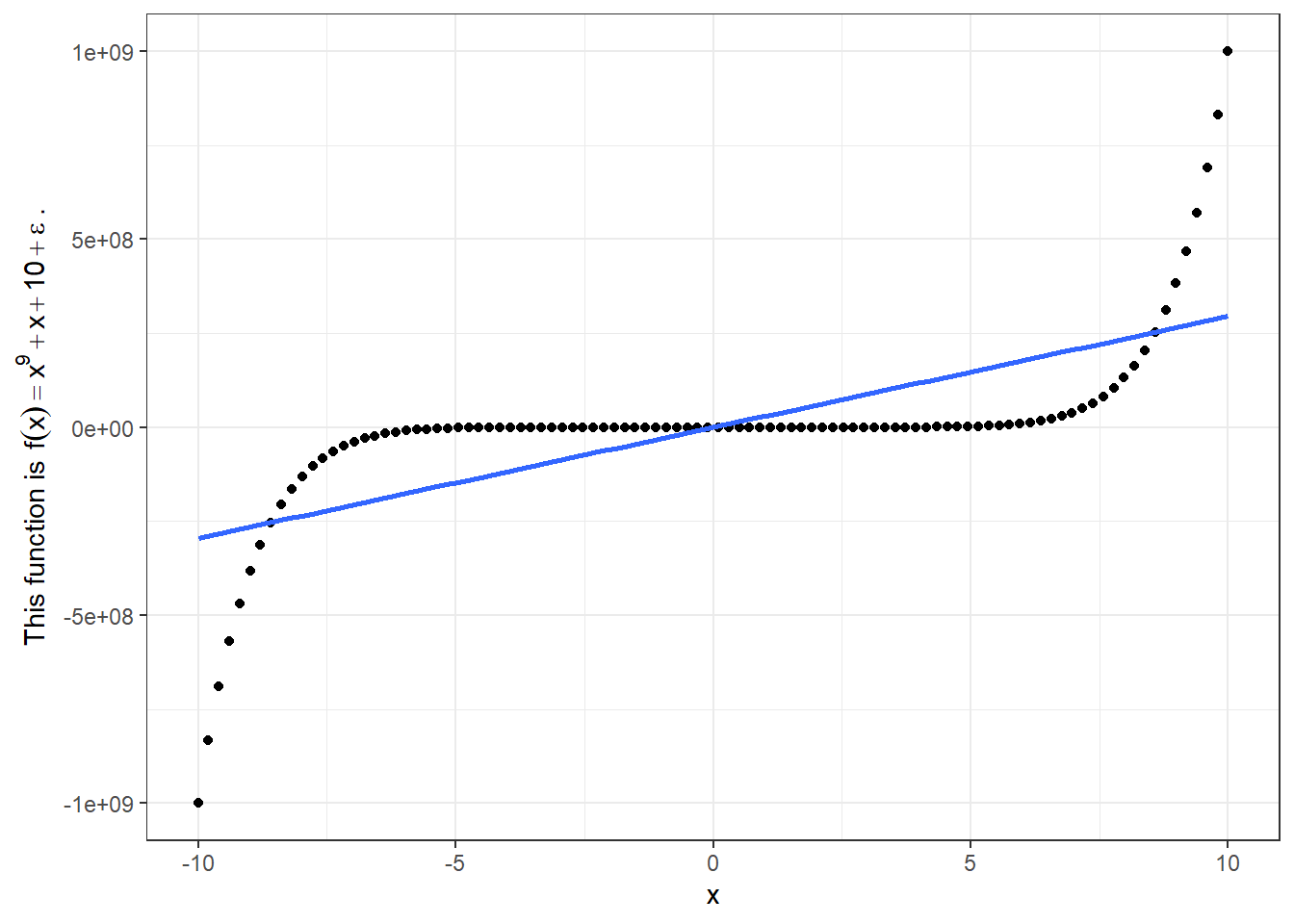
Mathematics quote ที่ใช้บ่อยมีดังนี้
| Syntax | Meaning |
|---|---|
"Text" ~ quote() ~ "Text" |
ตัวอักษรปกติ ~ Mathematical expression ~ ตัวอักษรปกติ |
x %+-% y |
x บวก หรือ ลบ y |
x %/% y |
x หาร y |
x[i] |
x ห้อยด้วย i (Subscript) |
x^i |
x ยกกำลัง i (Superscript) |
x ~~ y |
x เว้นวรรค y (ใน Mathematical expression เดียวกัน) |
sqrt(x, y) |
รากที่ y ของ x |
x <= y, x >= y |
x น้อยกว่าหรือเท่ากับ มากกว่าหรือเท่ากับ y |
infinity |
อนันต์ |
frac(x, y) |
เศษส่วน |
สามารถศึกษาเพิ่มเติมได้ที่ ?plotmath
7.2.3 Scales
ท่านสามารถปรับแต่ง Scale ของแกน x แกน y และสีต่างได้โดยใช้ฟังก์ชัน scale_*_*()
ggplot(df, aes(x = Sepal.Width, y = Sepal.Length, col = Species)) +
  geom_point() +
  scale_x_continuous(breaks = seq(0,5,0.5), # Major breaks
                     minor_breaks = seq(0,5,0.1), # Minor breaks
                     limits = c(1,5)) + # Axis limits
  scale_y_continuous(breaks = seq(0,8,0.5),
                     minor_breaks = seq(0,8,0.1),
                     limits = c(5,8)
                    ) +
  theme_bw()
## Warning: Removed 22 rows containing missing values (`geom_point()`).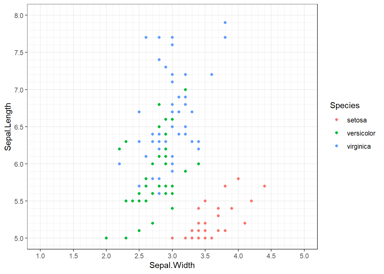
Note: ท่านจะเห็นข้อความเตือนว่าข้อมูลที่เกินกว่า Axis นั้นจะถูกตัดออกไป
นอกจากนั้น ท่านยังสามารถเปลี่ยนข้อมูลเป็นรูปแบบอื่นๆ ได้ด้วย
ggplot(df, aes(x = Sepal.Width, y = Sepal.Length, col = Species)) +
  geom_point() +
  scale_x_continuous(name = bquote(sqrt(Sepal.Width)),
                     trans = "sqrt") + # เปลี่ยนชื่อได้เลย
  scale_y_continuous(name = "Reverse Sepal.Length",
                  trans = "reverse") + # More information ?scale_x_continuous
  theme_bw()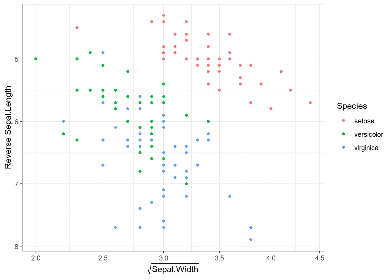
ในส่วนตัวแปรประเภท Discrete นั้นก็สามารถปรับเปลี่ยนได้เช่นกัน
ggplot(df, aes(x = Sepal.Width, y = Sepal.Length, col = Species)) +
  geom_point() +
  scale_color_manual(values = c("darkred", "darkblue", "darkgreen"),
    labels = c("Setosa", "Versicolor", "Virginica")) +
  theme_bw()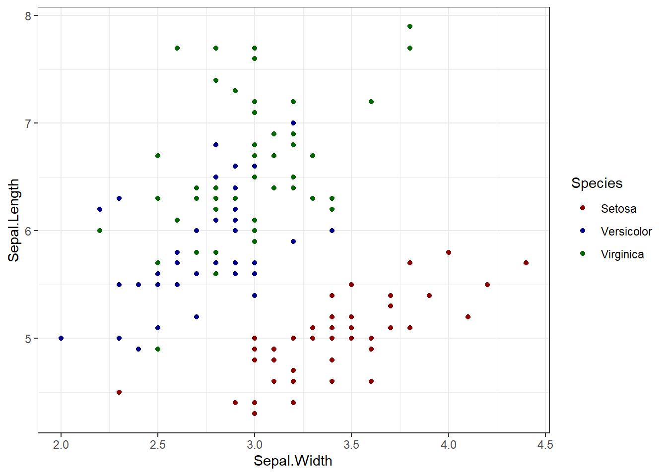
7.2.4 Color palettes
ggplot2 นั้นมีชุดของสีเตรียมไว้ให้ส่วนหนึ่งแล้วสำหรับการสร้างกราฟ โดยใช้ scale_*_brewer()
ggplot(df, aes(x = Sepal.Width, y = Sepal.Length, col = Species)) +
  geom_point() +
  scale_color_brewer(palette = "Dark2") +
  theme_bw()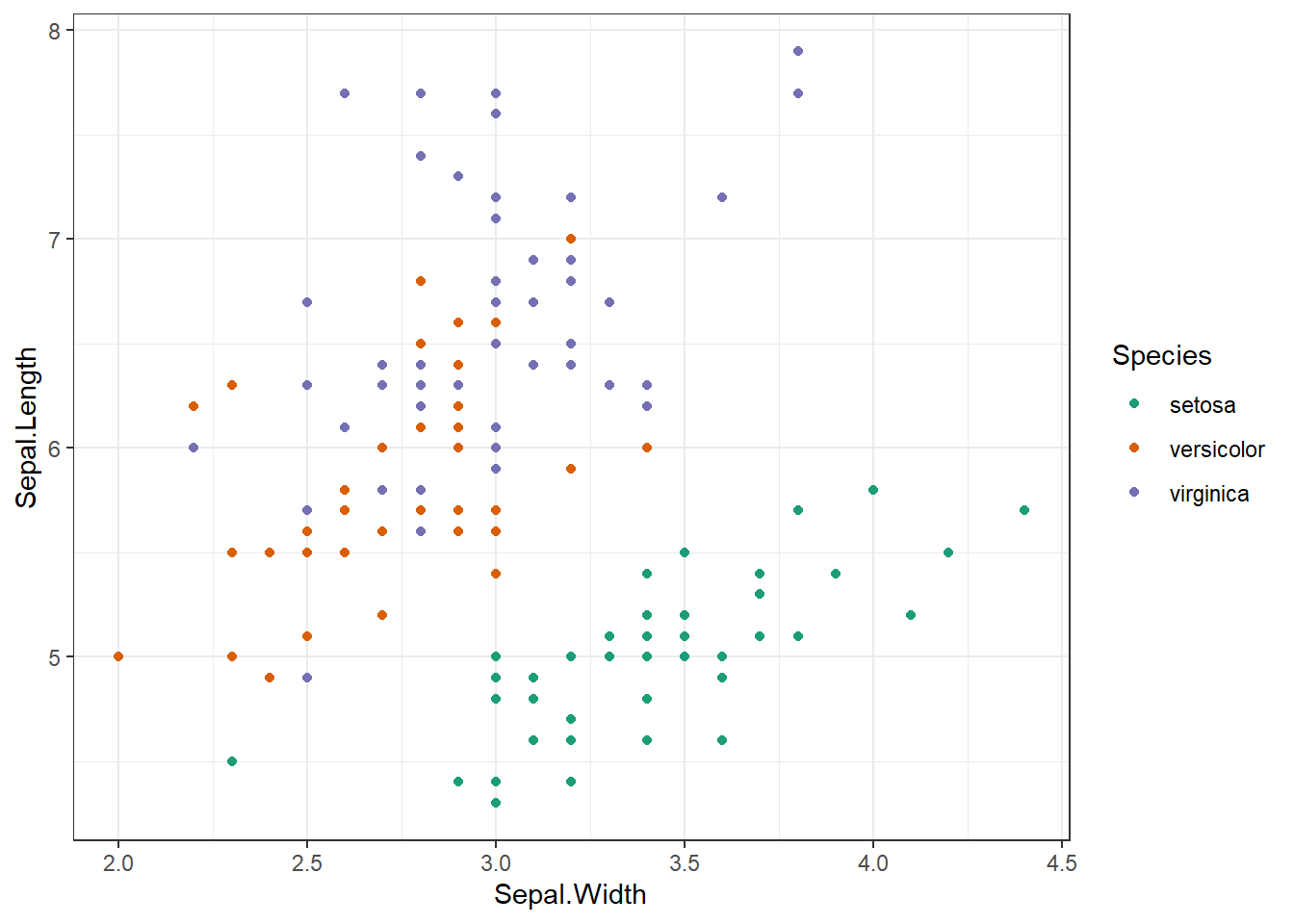
สีทั้งหมดที่มาพร้อมกับ ggplot2() มีดังนี้
RColorBrewer::display.brewer.all()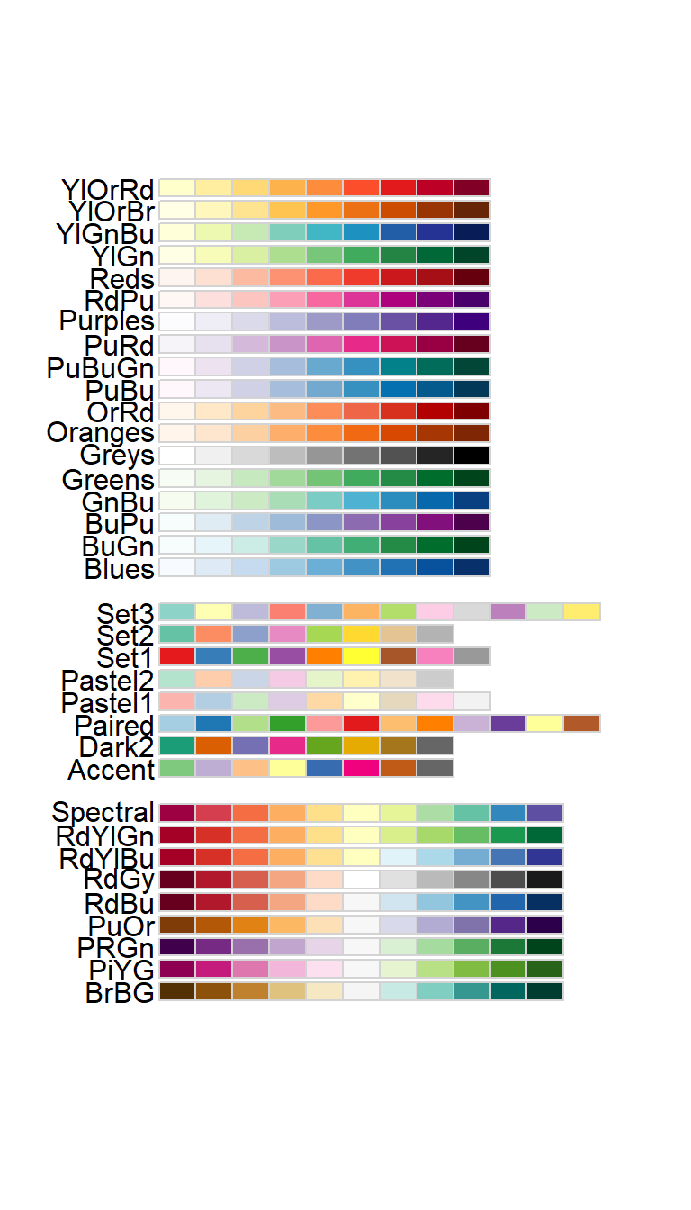
และยังมีสีเพิ่มเติมสำหรับการวาดกราฟที่ใช้บ่อยในสารสาร ต่างๆ ใน Package ggsci ศึกษารายละเอียดเพิ่มเติมได้ที่ https://nanx.me/ggsci/
library(ggsci)
ggplot(df, aes(x = Sepal.Width, y = Sepal.Length, col = Species)) +
  geom_point() +
  scale_color_nejm() +
  theme_bw()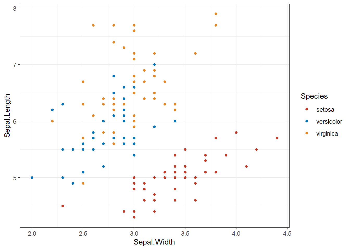
ในส่วนของสีที่เป็นพื้นที่ จะใช้ scale_fill_*() ซึ่งมีลักษณะการใช้ในแบบเดียวกัน
7.2.5 Themes
ในส่วนของภาพรวมของกราฟทั้งหมดนั้น สามารถปรับแต่งได้โดยฟังก์ชัน theme_*()
ggplot(df, aes(x = Sepal.Width, y = Sepal.Length, col = Species)) +
  geom_point() +
  theme_classic()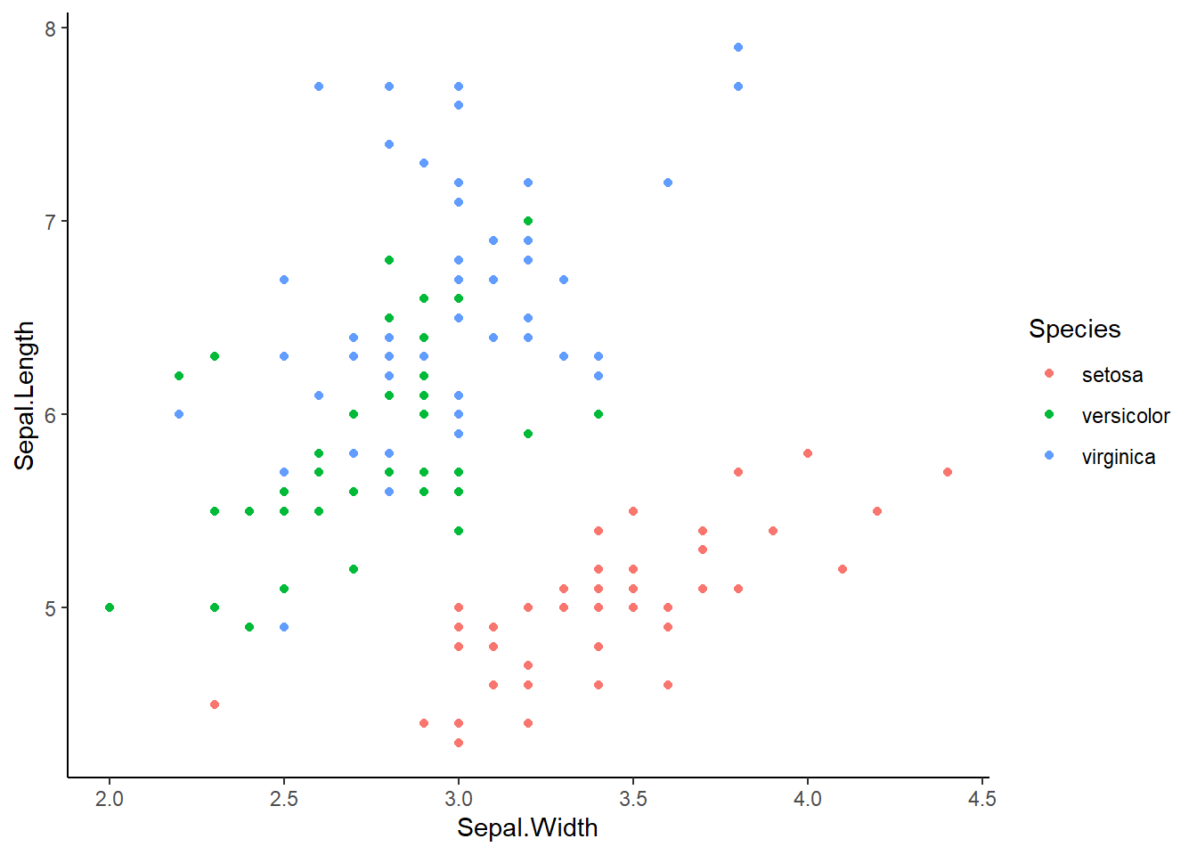
ซึ่ง Theme ที่ใช้บ่อยนั้น ได้แก่
ทั้งหมดที่แสดงนี้ เป็นเพียงกราฟพื้นฐานเท่านั้น ยังมีการปรับแต่งอื่นๆ ได้อีกมาก สามารถศึกษาเพิ่มเติมได้ที่
Function reference: https://ggplot2.tidyverse.org/reference/
Plot gallery: https://r-graph-gallery.com/
All extensions: https://exts.ggplot2.tidyverse.org/gallery/
Parameter ของ aesthetics ต่างๆ: เรียกฟังก์ชัน
vignette("ggplot2-specs")